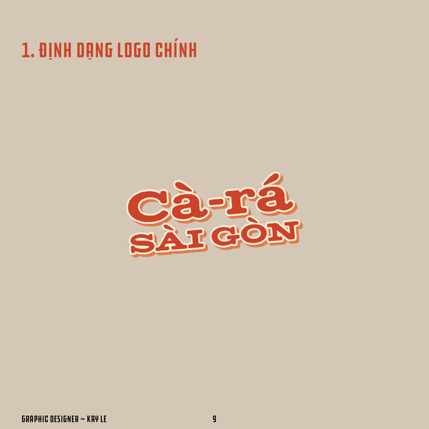
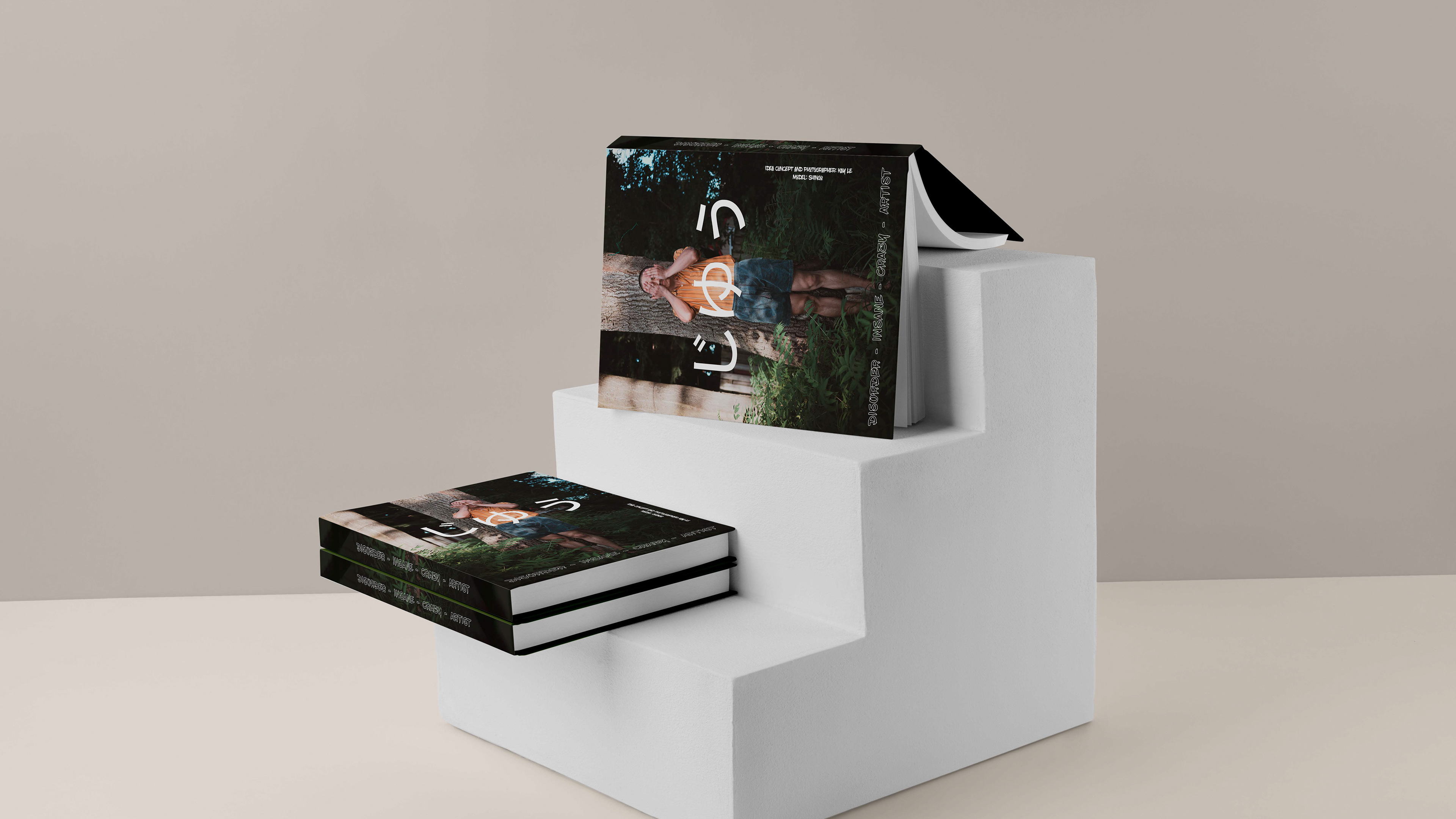
"Cà Rá Sài Gòn" is the new #branding project that I did in about 1 week.
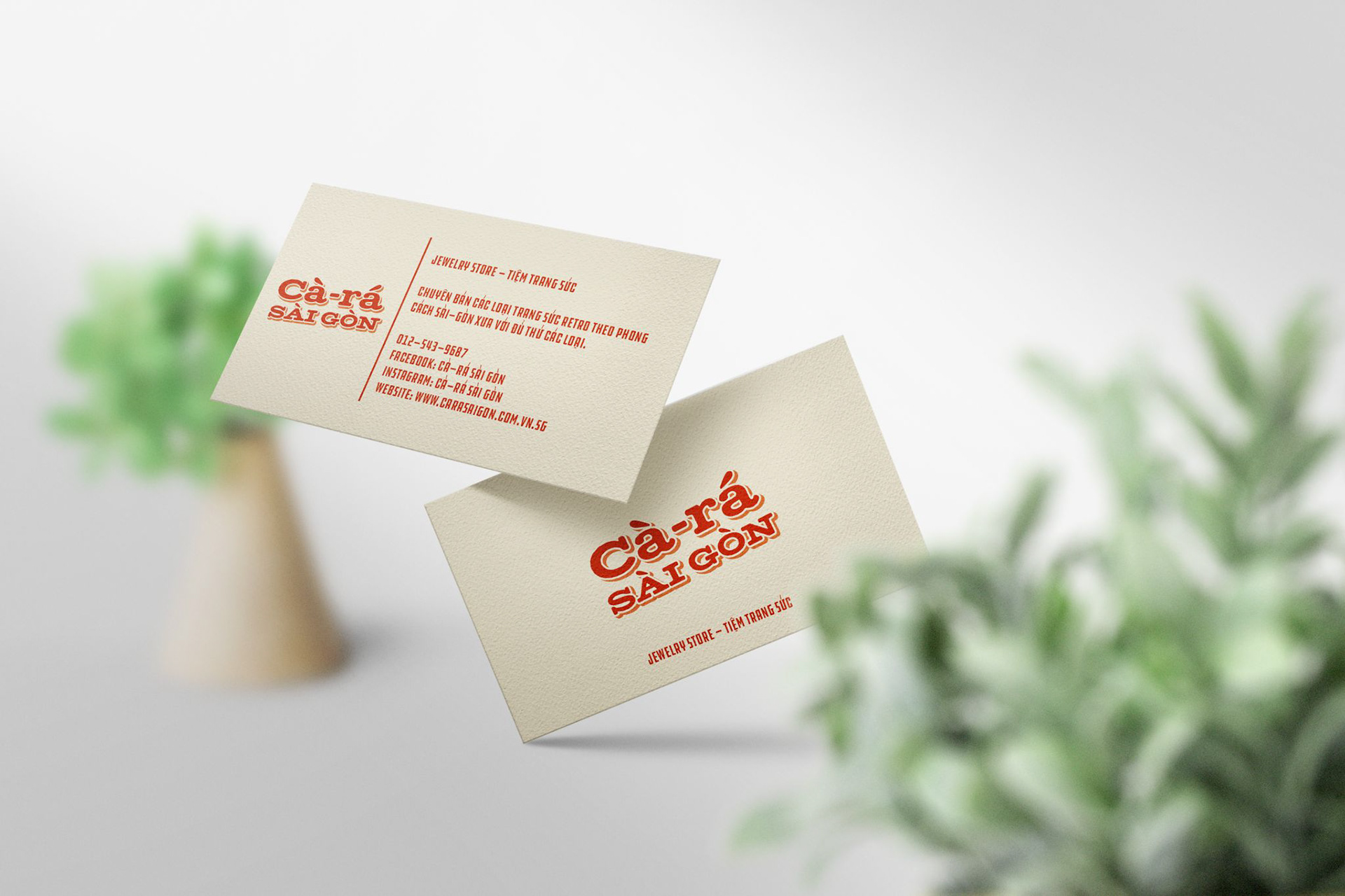
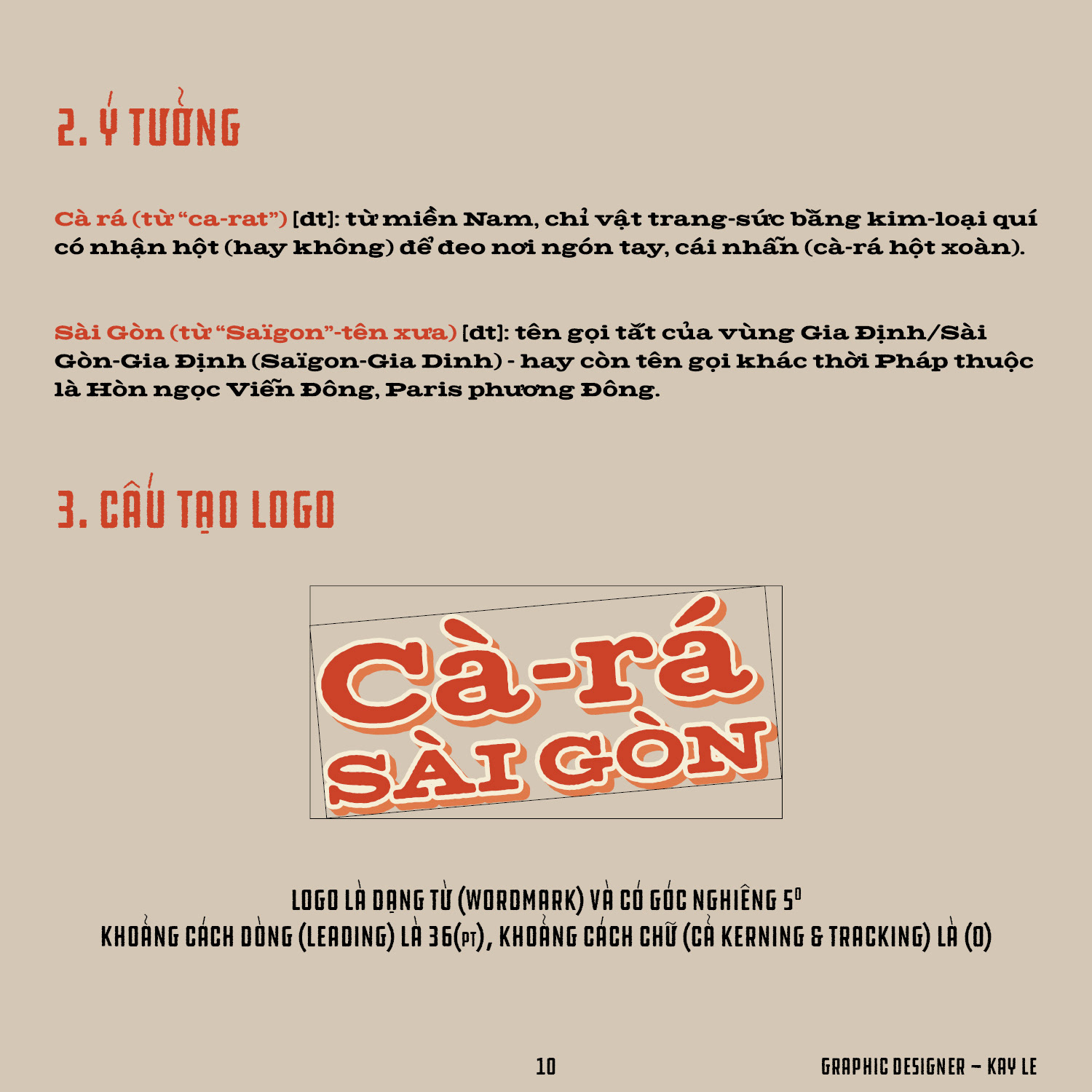
As "Cà Rá" means "ring" (an obsolete Southern vocab) and "Sài Gòn" is a documented name for "Ho Chi Minh City" before the 80s. And, allow me to introduce, "Cà Rá Sài Gòn" is a jewelry store that specializes in old-fashion style rings, necklaces, jewels.
About the project, in the very first stage, I #researched the #Indochine typography style (Saigon's typography style before 1975 the Vietnam War). Then I started brainstorming ideas about the brand name, font style, colour, etc. Paper sketching is my next step until I finalized elements in the digitalize phase.
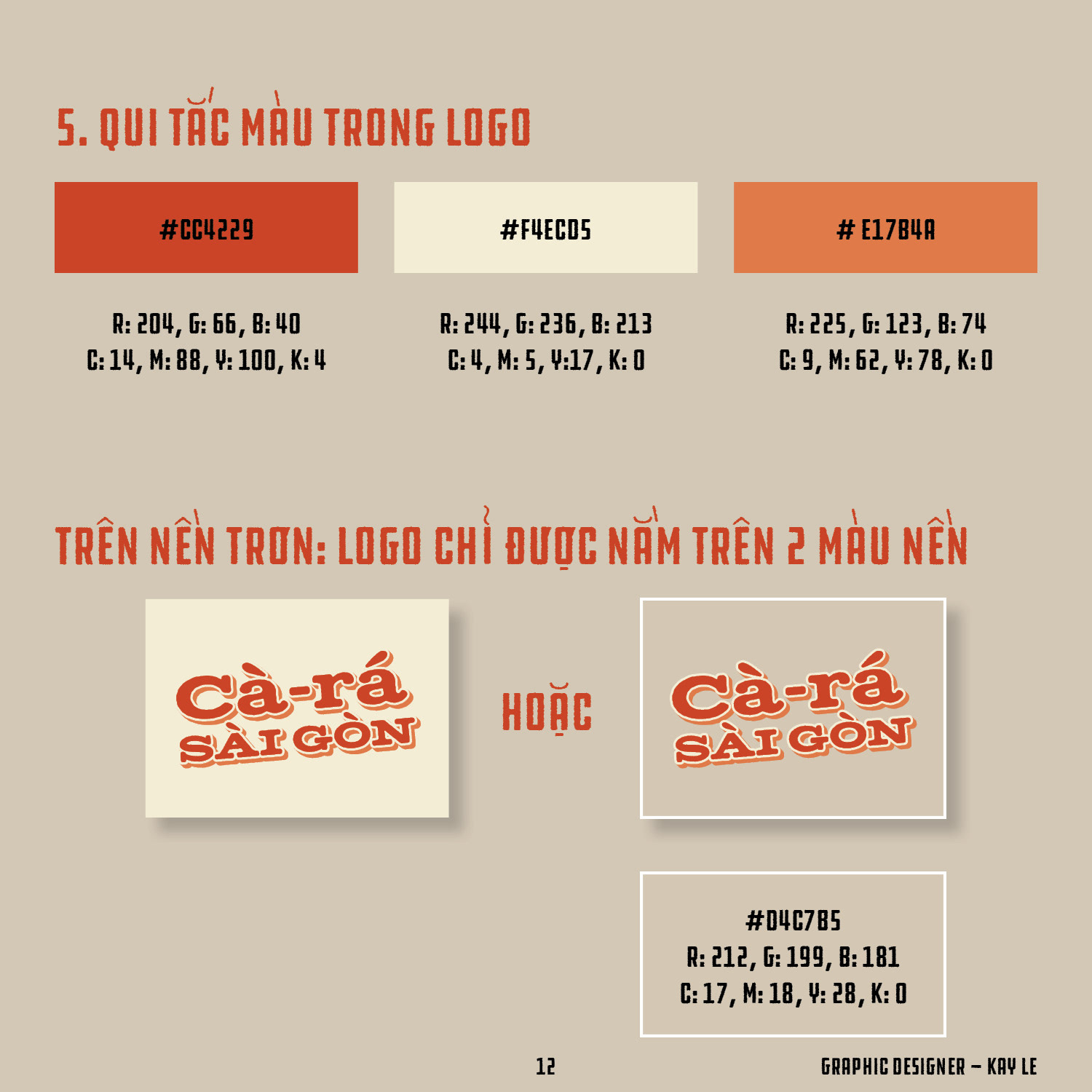
I know this is not a super #creative logo design with implications and symbols like modern #logodesign. However, I still firmly believe that this reflects the #vintage notion, not only because of the font but also because of the colour.
I want to recall Saigon's old-time (golden time) and unique font style through this project.
As "Cà Rá" means "ring" (an obsolete Southern vocab) and "Sài Gòn" is a documented name for "Ho Chi Minh City" before the 80s. And, allow me to introduce, "Cà Rá Sài Gòn" is a jewelry store that specializes in old-fashion style rings, necklaces, jewels.
About the project, in the very first stage, I #researched the #Indochine typography style (Saigon's typography style before 1975 the Vietnam War). Then I started brainstorming ideas about the brand name, font style, colour, etc. Paper sketching is my next step until I finalized elements in the digitalize phase.
I know this is not a super #creative logo design with implications and symbols like modern #logodesign. However, I still firmly believe that this reflects the #vintage notion, not only because of the font but also because of the colour.
I want to recall Saigon's old-time (golden time) and unique font style through this project.