The problem:
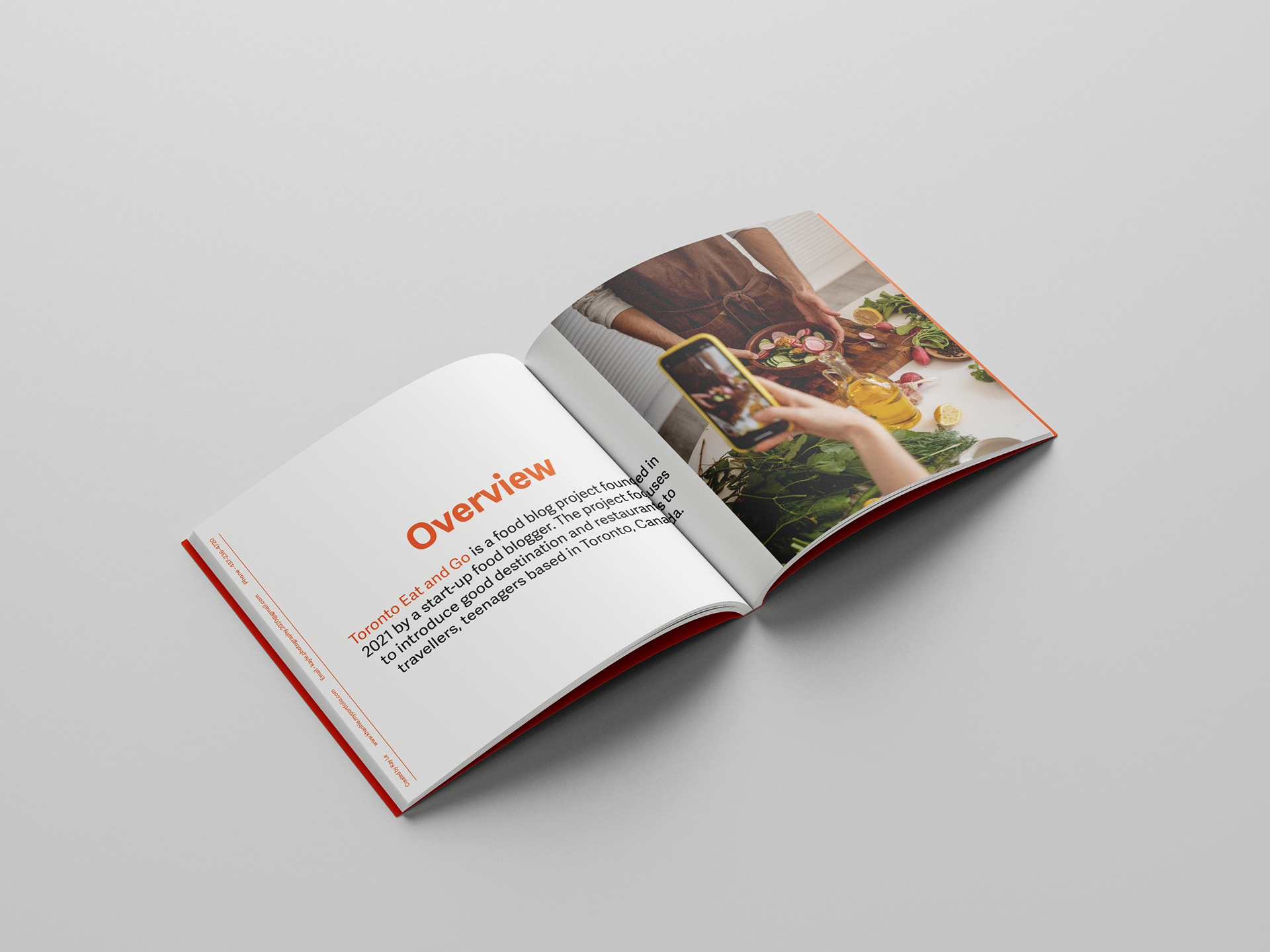
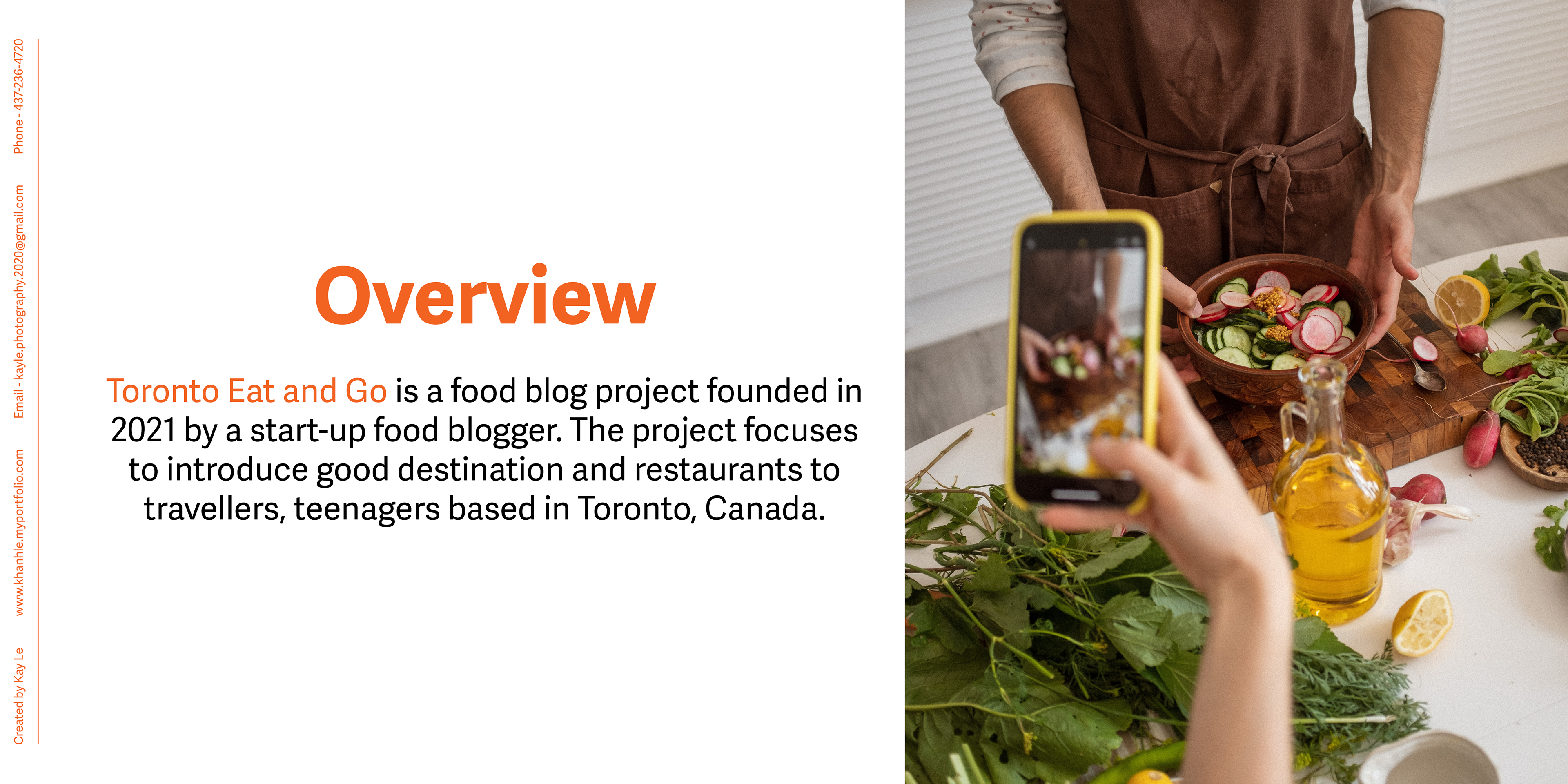
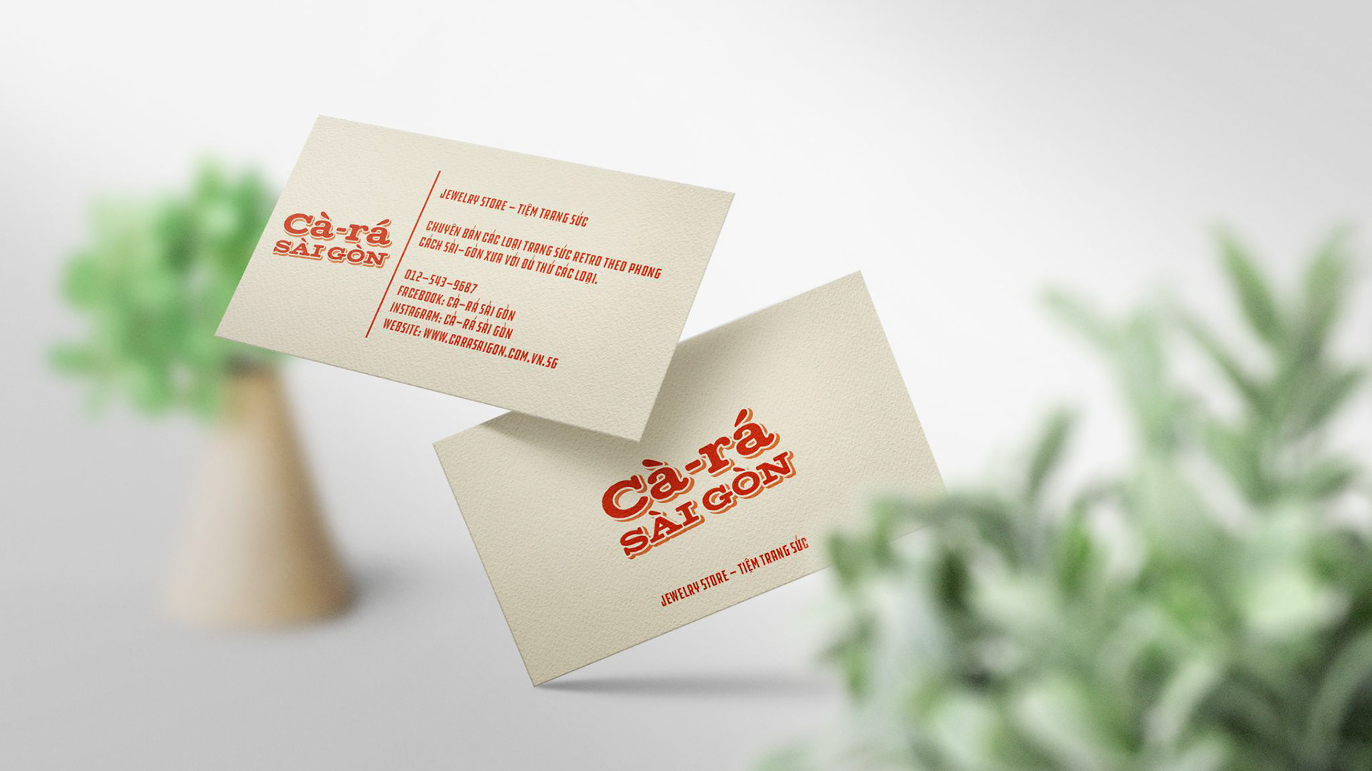
The project that I and my clients work on is called “TEG” (Toronto Eat and Go).
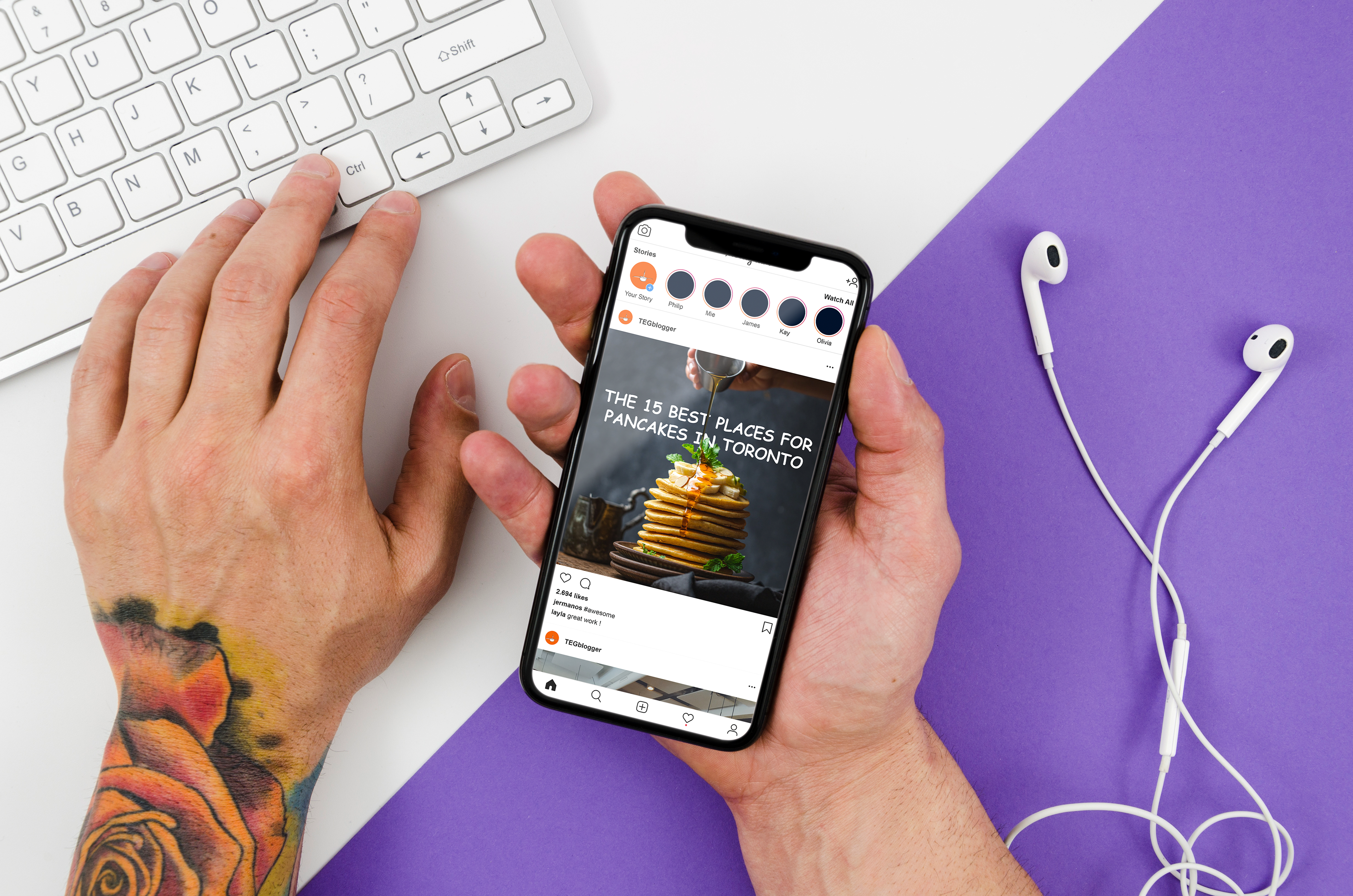
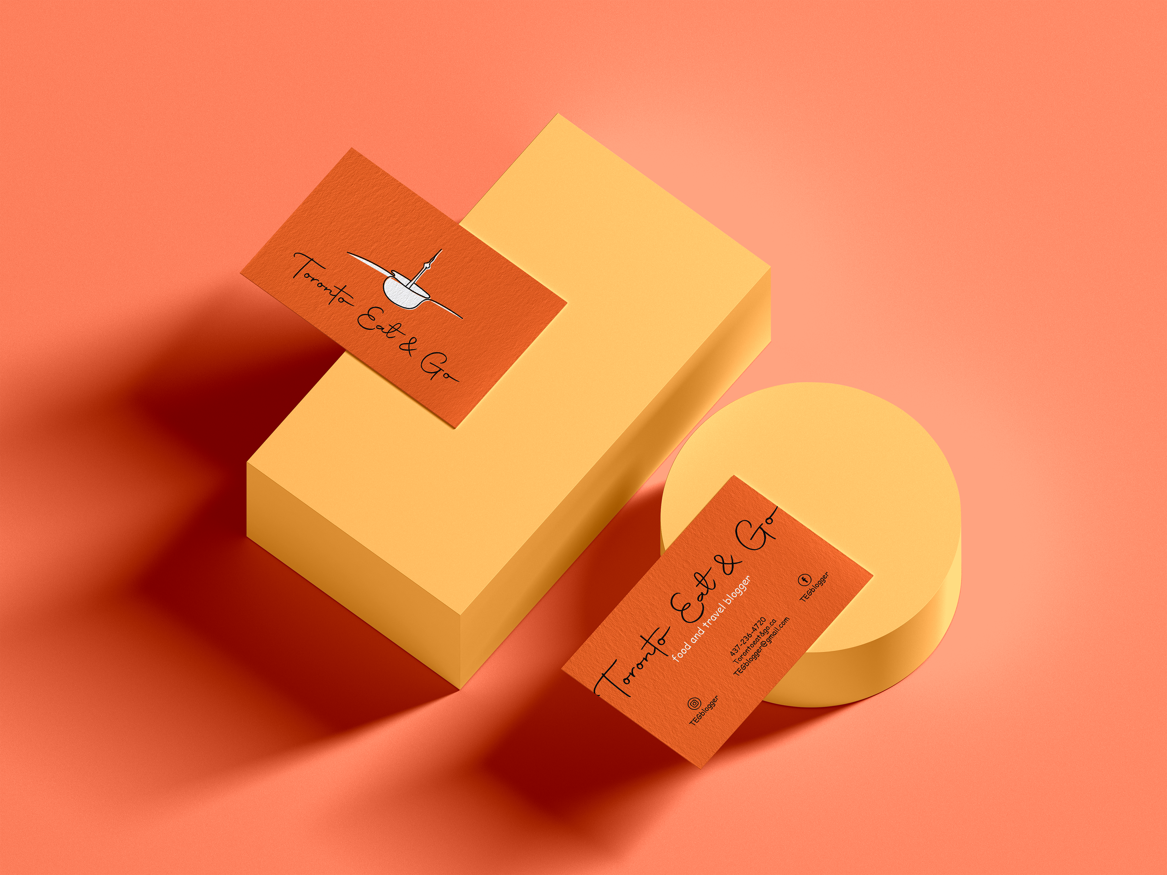
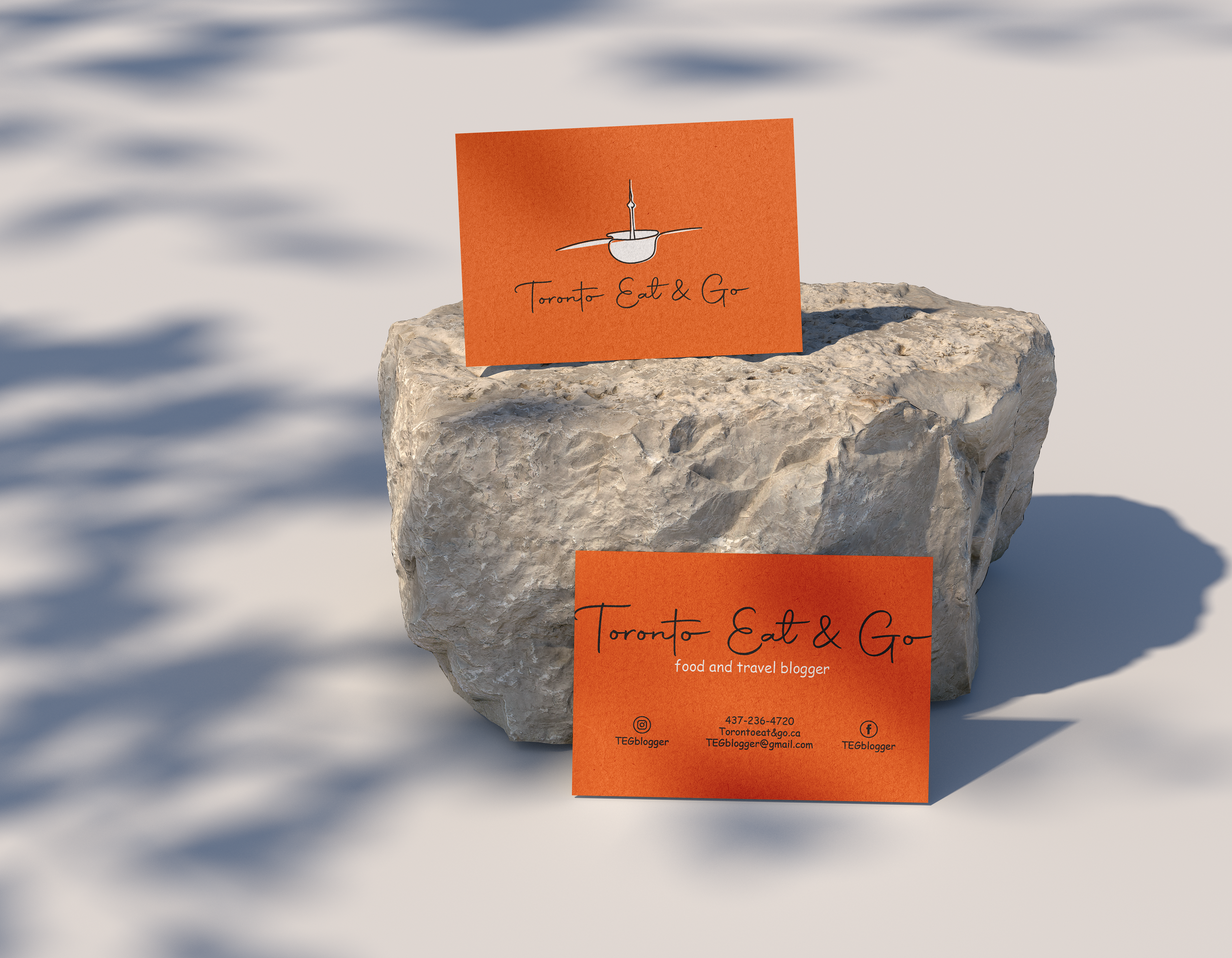
In this project, we are working on a logo, business card, online banner for social media to promote the TEG – which is a food-travel brand specializing in reviewing Toronto’s nice food and good location.
In this project, we are working on a logo, business card, online banner for social media to promote the TEG – which is a food-travel brand specializing in reviewing Toronto’s nice food and good location.
The challenge:
My client is a food blogger in Toronto, and he wants to promote his brand via marketing strategy, including the brand’s logo, business card, and Facebook/ Instagram page. When the client came to me, he didn't have any idea how the logo would be, and everything started from the beginning.
The project is considered successful when:
The project helps increase customers counted by week, creates a well-known brand over the city of Toronto. To be more detailed, we plan that each week, the number of followers on Facebook and Instagram pages should rise by at least 50 followers each week. There will be at least 25 business cards that should be given to the restaurant/ event planner every two weeks.
Target audience:
_ Restaurants and event planners will be the first end-user of the project deliverables. Clients will give them business cards, ask for follow on social media so that they have the chance to work together in the future.
_ Vietnamese people who are living in Toronto or plan to go to Toronto for traveling, working, studying.
_ Travel agency also can be another end-user. They keep the TEG’s business card, and thanks to the understanding of food and places, maybe TEG will be a brand ambassador for them to introduce food, culture, location, etc, to travelers.
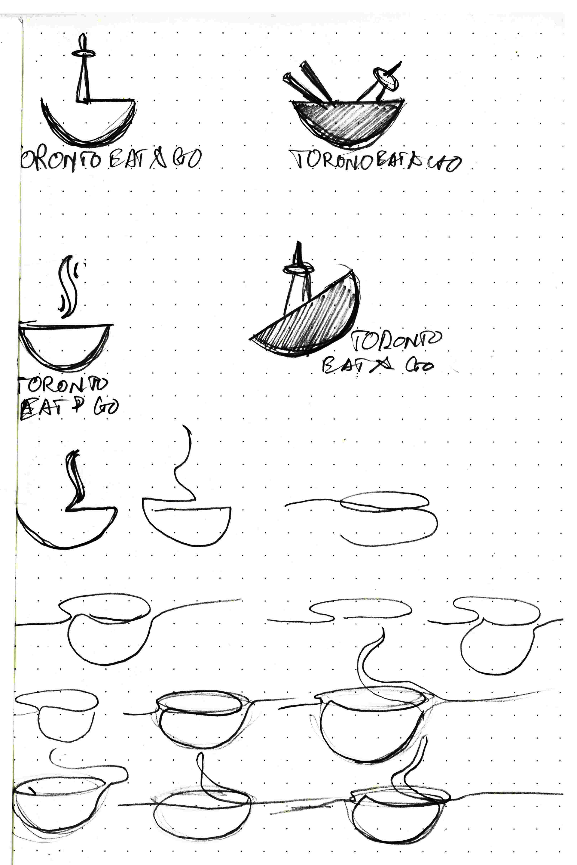
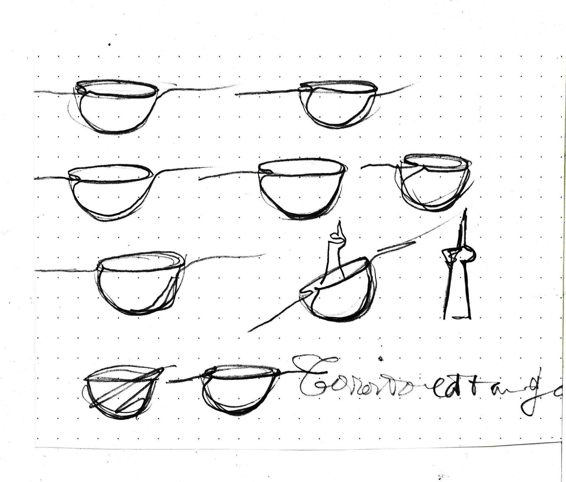
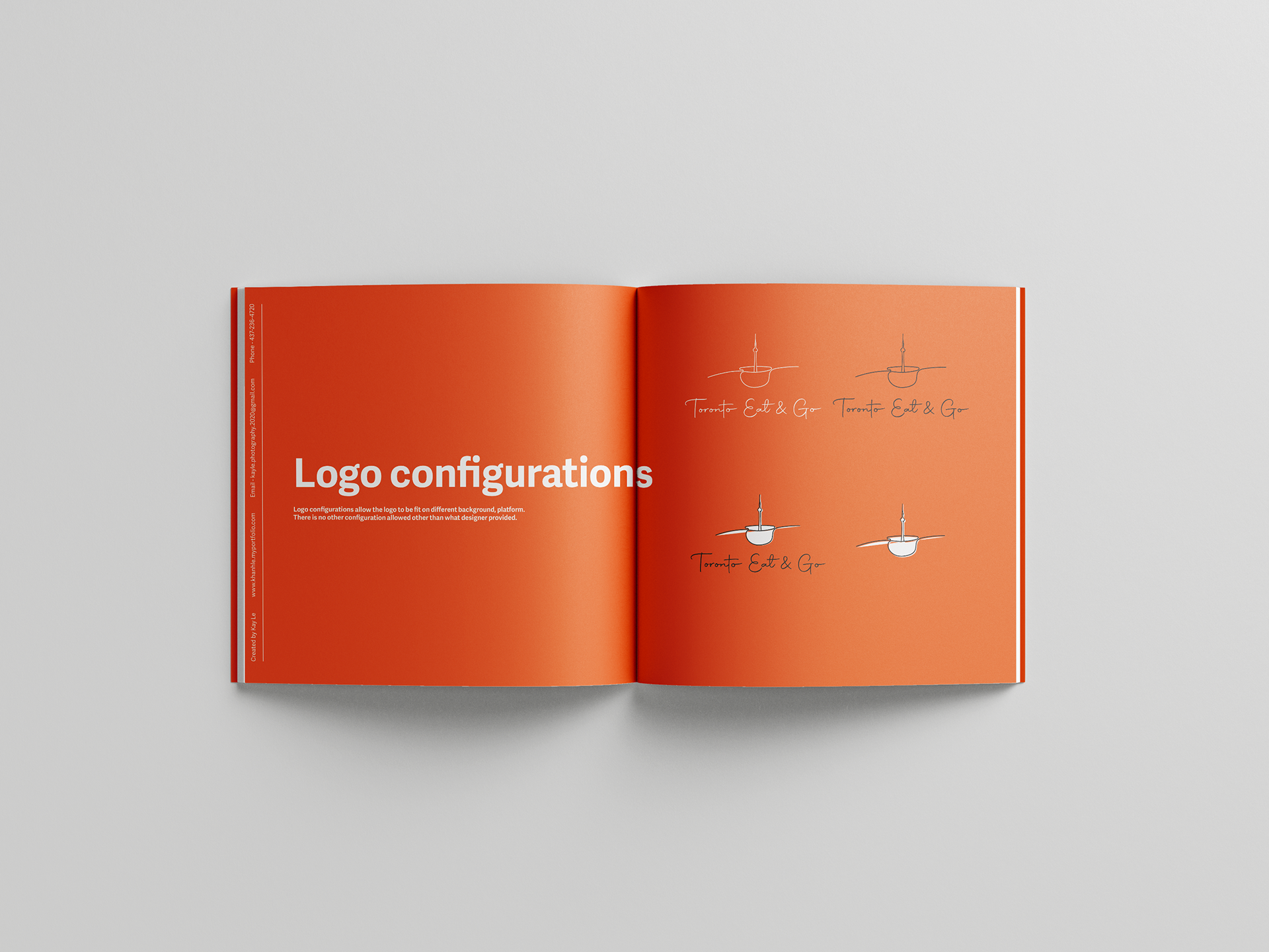
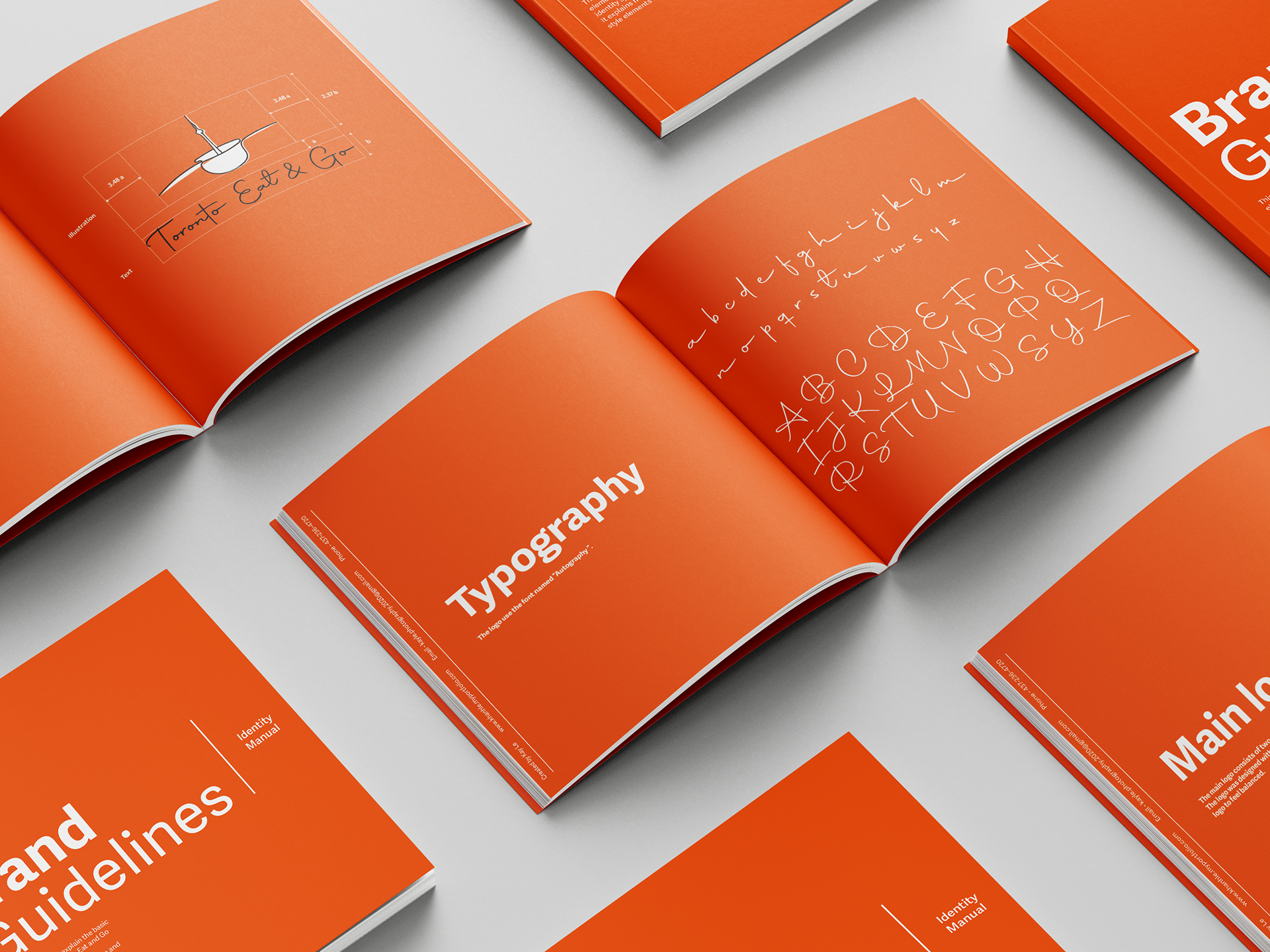
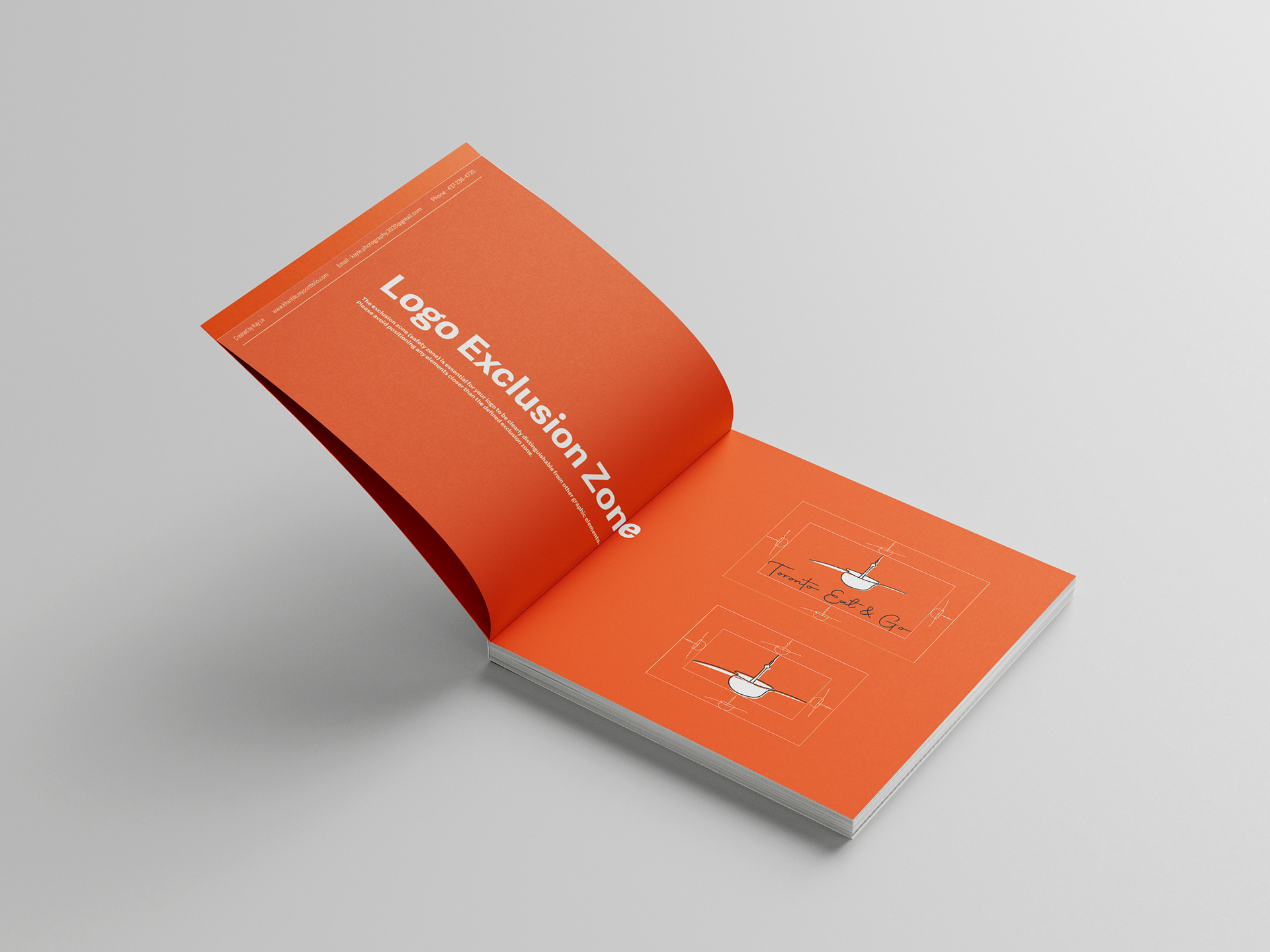
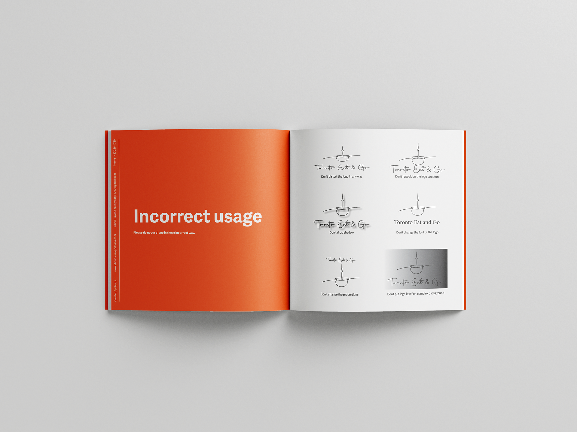
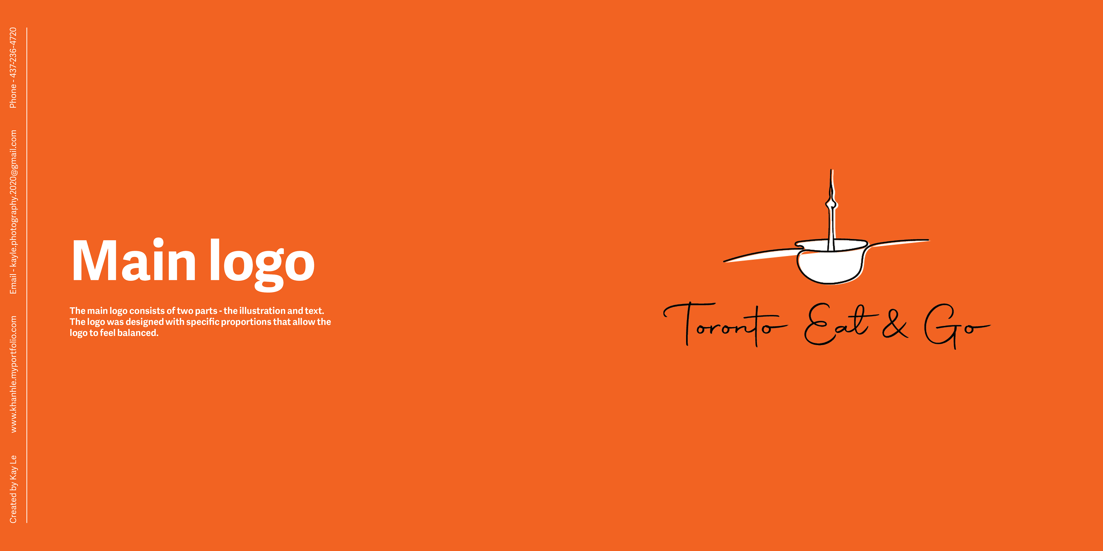
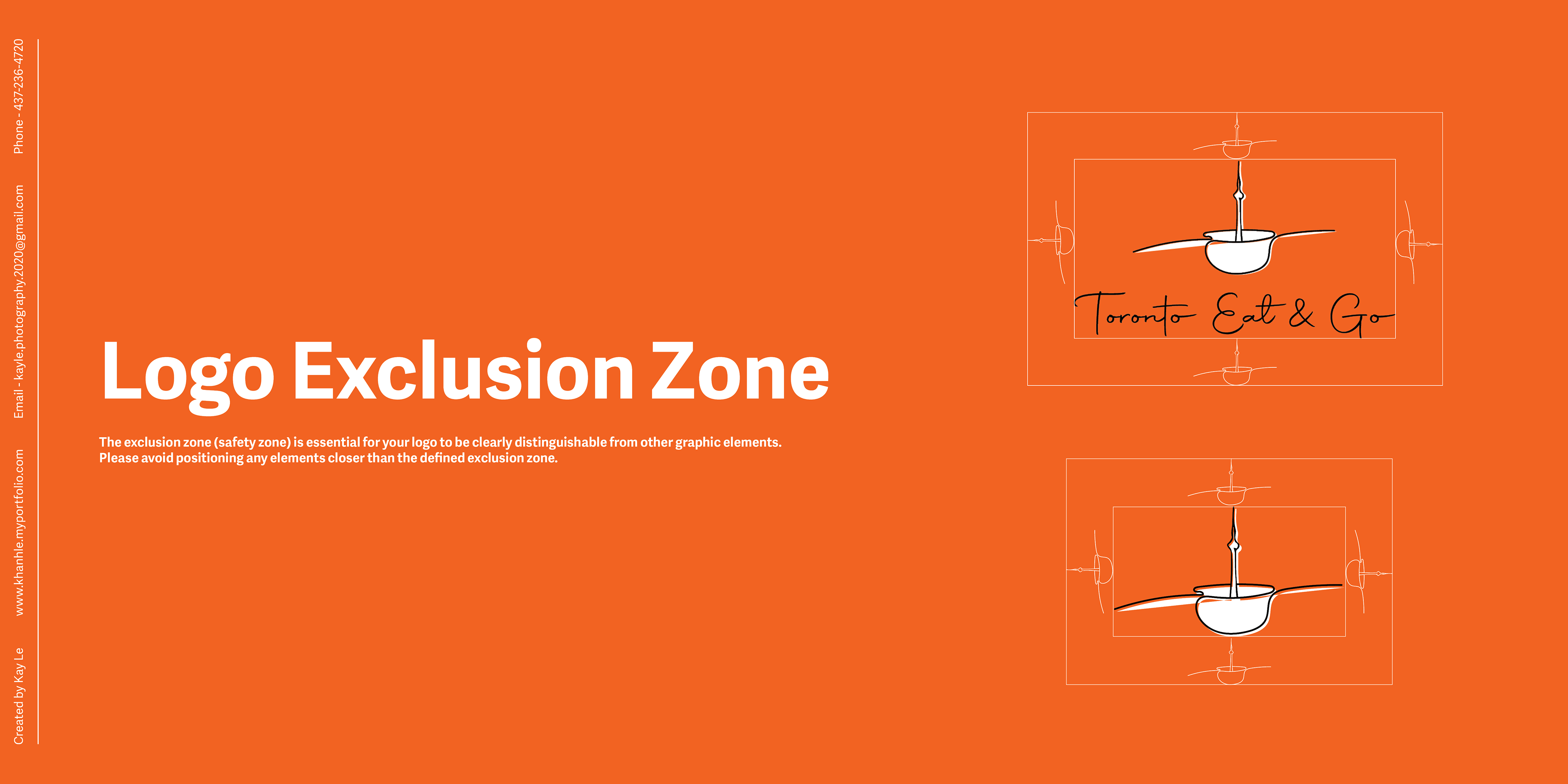
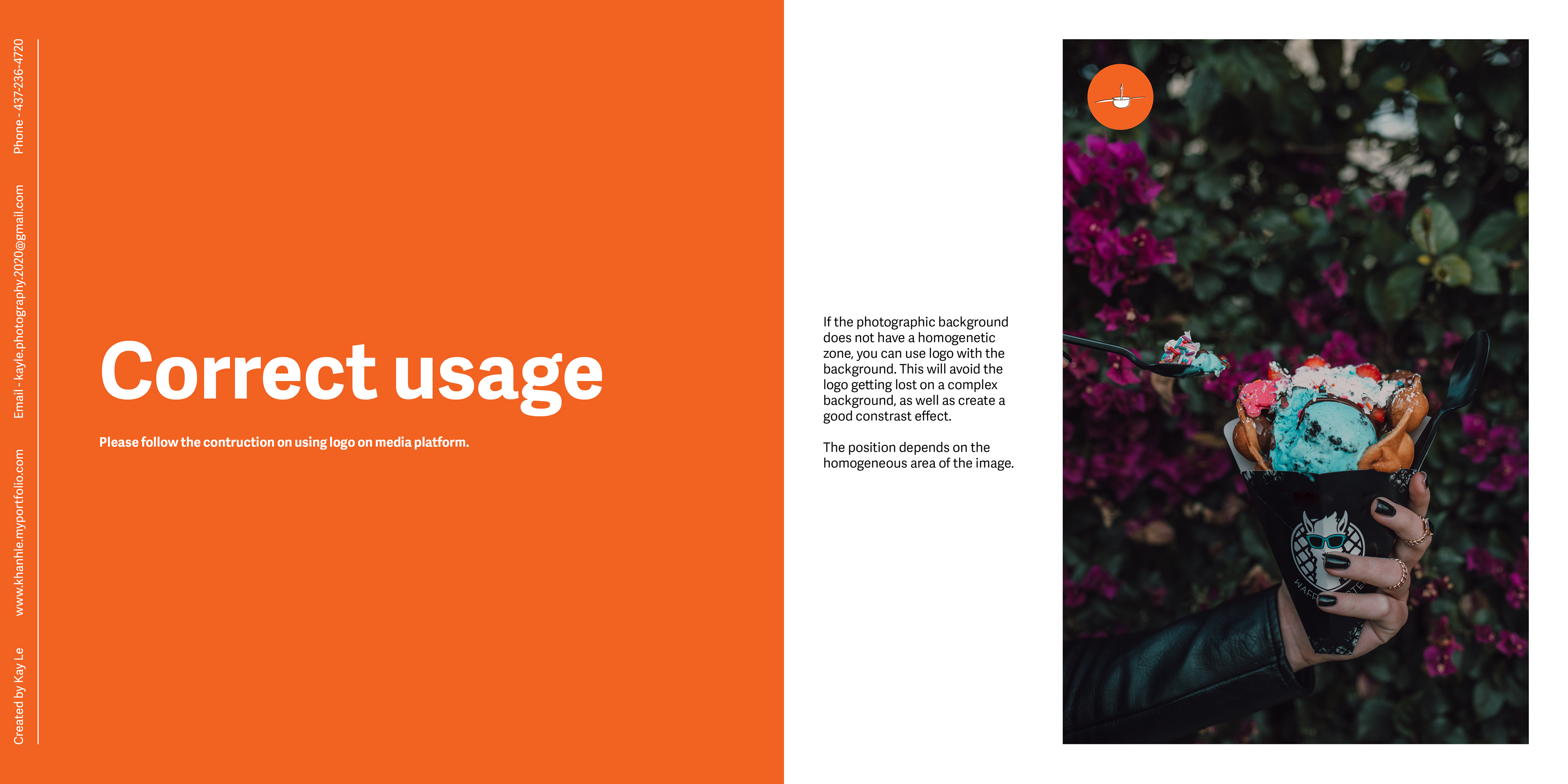
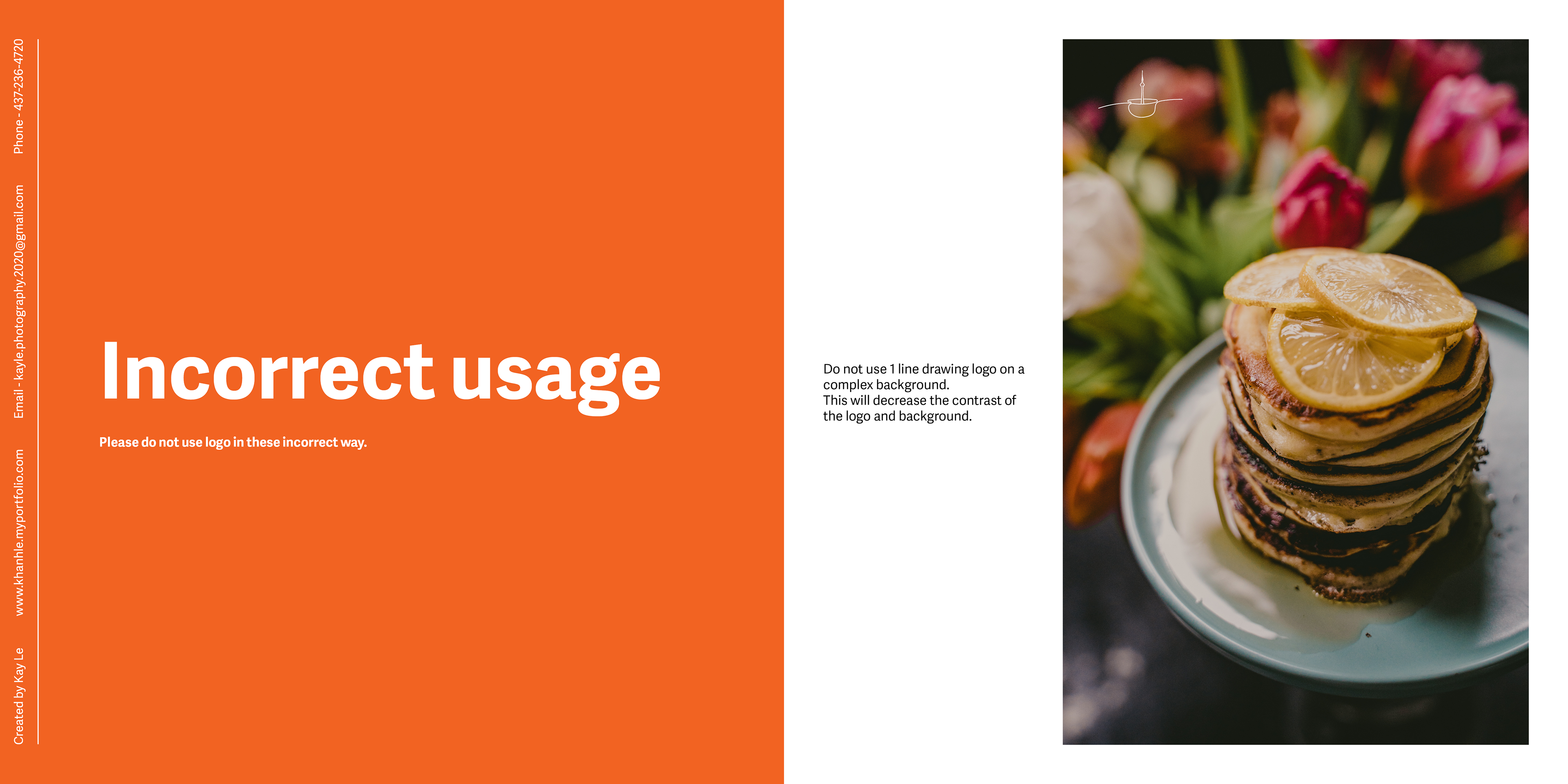
The logo will approach a very simple illustration and I think the best way to combine the meaning of Toronto Eat and Go (Toronto, Eat, Go - places, food, and travel) is to put the CN Tower inside a bowl.
I would use one line drawing technique to illustrate the art style which makes the logo feel modern and elegant.